In Flutter, a Card is a material design widget that represents a card surface. It is often used to group related information together in a visually appealing way. Cards can contain various elements such as text, images, buttons, etc. Here’s a description of the main features of a Card in Flutter along with examples:
1. Basic Card:
A basic card consists of a container with some padding and may contain a combination of widgets.
Card(
  child: Column(
    children: <Widget>[
      ListTile(
        leading: Icon(Icons.album),
        title: Text('Card Title'),
        subtitle: Text('Subtitle'),
      ),
      ButtonBar(
        children: <Widget>[
          FlatButton(
            child: Text('Button 1'),
            onPressed: () {},
          ),
          FlatButton(
            child: Text('Button 2'),
            onPressed: () {},
          ),
        ],
      ),
    ],
  ),
)
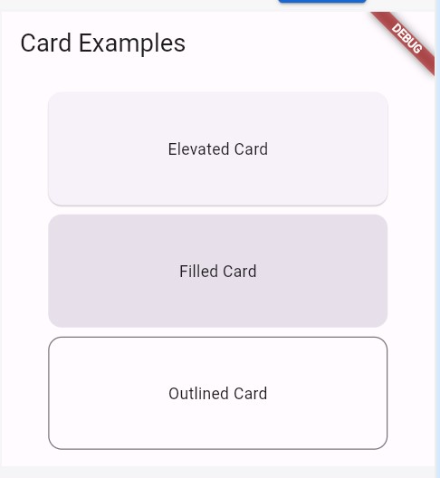
Cards Design in Flutter
2. Card with Image:
Cards often include an image to visually represent the content.
Card(
  child: Column(
    children: <Widget>[
      Image.asset('assets/image.jpg'),
      ListTile(
        title: Text('Card with Image'),
        subtitle: Text('Description'),
      ),
    ],
  ),
)
3. Customized Card in Flutter:
You can customize the appearance of the card using properties like color, elevation, and shape.
Card(
  color: Colors.blue,
  elevation: 5.0,
  shape: RoundedRectangleBorder(
    borderRadius: BorderRadius.circular(15.0),
  ),
  child: // ... Your card content ...
)
4. List of Cards:
Cards can be used in lists to display multiple items.
ListView(
  children: <Widget>[
    Card(
      child: ListTile(
        title: Text('Item 1'),
      ),
    ),
    Card(
      child: ListTile(
        title: Text('Item 2'),
      ),
    ),
  ],
)
5. Card with Buttons:
You can include buttons within a card to allow user interaction.
Card(
  child: Column(
    children: <Widget>[
      ListTile(
        title: Text('Card with Buttons'),
      ),
      ButtonBar(
        children: <Widget>[
          FlatButton(
            child: Text('Action 1'),
            onPressed: () {},
          ),
          FlatButton(
            child: Text('Action 2'),
            onPressed: () {},
          ),
        ],
      ),
    ],
  ),
)
6. Card with Gesture Detector:
You can wrap a card with a GestureDetector to make the entire card clickable.
GestureDetector(
  onTap: () {
    // Handle the tap
  },
  child: Card(
    child: // ... Your card content ...
  ),
)
7. Card with Stack:
Use a Stack widget to overlay multiple widgets within a card.
Card(
  child: Stack(
    children: <Widget>[
      Image.asset('assets/background_image.jpg'),
      Positioned(
        bottom: 10.0,
        left: 10.0,
        child: Text('Overlay Text'),
      ),
    ],
  ),
)
8. Responsive Design:
Make your cards responsive by adjusting the layout based on screen size.
Card(
  child: LayoutBuilder(
    builder: (context, constraints) {
      if (constraints.maxWidth > 600) {
        // Large screen layout
        return // ... Large screen content ...
      } else {
        // Small screen layout
        return // ... Small screen content ...
      }
    },
  ),
)
These examples cover various aspects of using cards in Flutter. Depending on your specific use case, you can combine these features to create visually appealing and interactive card-based UI components in your Flutter application. See more about this from here
More useful contents:
Flutter Isolate With Example | FlutterPoint
GridView in Flutter Full Example
How to show Image in Flutter
Method Channel in Flutter Full Explanation With Examples
Flutter Bloc State Management
GetX State Management in Flutter
State Management In Flutter
Provider in Flutter
How to Integrate Firebase in Flutter | With Examples